Notes toward fonts as data (with opentype.js and p5.js)
NOTE: These notes are incomplete and much material is TK.
Fonts are complicated. Really complicated. You wouldn’t believe how complicated fonts are.
Terminology
Parts of letters:
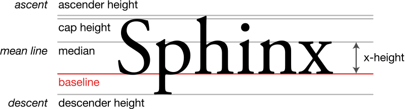
Also relevant: Counters and apertures
Units of measurement:
- Point (1/72nd of an inch)
- Em (the width of a capital ‘M’ in a font)
- Pixel (the distance from one side of a pixel in a display to the other; may differ horizontally and vertically; some LCDs can have meaningful ‘sub-pixel’ addressing; “pixel” can mean something different on high-density displays)
Letter forms by their nature are analog (formed from continuous curves). Rasterization is the process of “sampling” the analog curves to a grid, for (e.g.) display on a screen.
History
- Punches, matrices, and sorts
- Cross-stitch
- Phototypesetting
- Rudolf Hell’s Digiset (made from hand-digitized rasters)
- Early vector fonts: Hershey’s Calligraphy for Computers (stroke, not outline); Hershey fonts in JSON format
- Stroke fonts (Hershey and Knuth)
- Early outline fonts (Karow’s Ikarus)
- Bitmap fonts for low-resolution displays (Susan Kare)
- TrueType and OpenType
- Variable fonts?
Components of TrueType/OpenType fonts
The most common digital formats for fonts are TrueType (.ttf) and OpenType
(.otf), two closely related standards defined and implemented by a dizzying
amalgamation of Adobe, Apple and Microsoft during the 1990s and early
2000s. Both are variants of
the SFNT format and share many of the
same abstractions but differ in many particulars. I attempt to explain the
important components of both formats in this section.
Characters and glyphs
A text is often said to be made up of a string of characters. A character is the basic unit of writing: they’re what you learn when you learn to write.
The most important part of a font file is the “glyphs,” which are the
individual, distinct marks that the font can produce. In many cases, there is a
one-to-one correspondence between glyphs and characters (e.g., the glyph c
represents the character c) but some glyphs represent multiple characters
(e.g., ligatures like fi) and some characters may be represeted by more than one
glyph (stylistic or contextual variants, e.g., the character s in early
modern English, represented as ſ when found in the middle of a word, and s
when found at the end).
For this reason, TTF/OTF fonts include information on how to map characters to glyphs. The most straightforward way to do this is with the cmap table, which links a character (given as, e.g., Unicode code points) to a numbered glyph in the font. Substitution features in OpenType allow the font designer to specify that certain sequences of characters should be represented with particular glyphs (like ligatures, but this feature also be creatively misused; see Sans Bullshit Sans and Doggy). A font file may also specify other visual aspects of how the text should be rendered, like kerning (adjusting the horizontal and/or vertical space between pairs or longer sequences of characters), which in OpenType is specified in the GPOS table.
Another aspect of appearance often specified in a font is hinting, which specifies how the vector data in the font should be adjusted during the rasterization process (i.e., displaying on a pixel-based screen), to ensure that the important parts of each glyph are displayed even when interpolated. The TrueType font format has an absurdly sophisticated system for font hinting, including a Turing-complete programming language, which has led to some truly spectacular security vulnerabilities.
Shape information
In TrueType and OpenType fonts, the shape of a glyph is specified using data in
an sfnt table (called either glyf or CFF ). The point of the data is to
define the lines and curves that form the outline of the shapes. The actual
formats of these tables are quite frankly baroque and overly complicated; see
the glyf
specification
and the CFF
specification.
For our purposes, it’s not worth talking about the details, since the library
we’ll be using to parse the font files will smooth everything over for us.
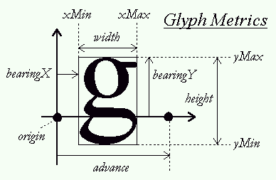
In general, the outline of a glyph is comprised of a series of one or more contours (shapes), which are in turn comprised of lines and curves (with 2D coordinates). In TrueType and OpenType fonts, the start/end positions are integers on a grid whose resolution is defined by the font itself (e.g., 2048 units per em), with the origin generally at the lower left-hand corner of the glyph. The opentype.js website has a good demo showing the curves, lines and metrics from an OpenType font.
This illustration from the FreeType documentation names some of the metrics associated with a (horizontal) glyph. For example, the character’s bearing is a measure of how far from the origin the glyph is; the advance of a character controls how much the “pen” should be moved forward after drawing the character; this may be different from the character’s width.
Curves
A contour specification consists of lines and curves. Representing a line as data is very easy; you just need to indicate the coordinates of the start and end of the segment. Representing a curve is a little bit more difficult, and there are multiple strategies for accomplishing this. The most common way to represent curves is as Bézier curves. Named after French engineer Pierre Bézier, who used the math behind the curve in industrial design in the 1960s, a Bézier curve consists of two anchor points and a series of control points. The anchor points define the beginning and ending of the curve, and the control points define the extent of the curvature. A Bézier curve with one control point is called quadratic and one with two control points is called cubic. Higher order curves are possible, but because the use of cubic curves is so widespread in software, the term “Bézier” is often used specifically to mean cubic Bézier curves. (This reflects the usage in p5.js: see bezier() and quadraticVertex() in the documentation.)
The following demo lets you play with a cubic Bézier’s anchor and control points:
And the demo below does the same for a quadratic curve:
Here’s a helpful introduction to the math behind Bézier curves, how they’re represented as data and how to efficiently rasterize them. (You don’t need to read or understand all of this in order to make use of Bézier curves, but it’s helpful to read at least the first few sections.) The author of that tutorial has also made a wonderful library for working with Bézier curves in JavaScript. The p5js library also includes a few helper functions for working with Bézier curve math: bezierPoint() and bezierTangent().
The distinction between quadratic and cubic curves is important, because
TrueType fonts (with glyf tables) only support quadratic curves, while
OpenType fonts (specifically those that use the CFF table) make use of
cubic curves. If you want to be able to draw glyphs from either format, you
have to be able to draw both kinds of curves.
Counters and cutouts
Many glyph outlines consist of more than one contour: the letter j for
example has a contour for the body of the letter and a separate
(non-overlapping) contour for the dot.
Additionally, some glyph outlines have have closed
counters: contours of the
glyph that are completely enclosed within another contour. (The “hole” in the letter O is an example; a capital B has two counters.) Some glyph outlines, like ®, have contours within contours within contours!
So the question arises: in a glyph outline, how do you know which contours should be filled in, and which should be “cut out”? (Otherwise stated: how do you know which points are “inside” the letter and should be filled in, and which points are “outside” the letter and should be left blank?)
This is one of the trickier parts of rendering a glyph. TrueType glyf fonts
use one strategy: if the points in a contour are defined in a clockwise
fashion, then the shape should be filled; if they’re defined in a
counter-clockwise fashion, then the shape should be cut out. In OpenType CFF
fonts, contours are considered cutouts if they’re contained inside an odd
number of other paths.
(Source.) In either
case, finding out whether a contour should be cut out or filled in depends on
doing some math on the points and curves of the contours themselves.
Opentype.js
Opentype.js is a library for reading and writing TrueType and OpenType font files in JavaScript. For our purposes, its most important feature is the ability to load the outline data from these fonts, which lets us look at and play around with how the glyphs are formed.
Once you load a font with Opentype.js, you can create paths, which are instructions about how to draw shapes. Opentype.js paths take the form of a list of commands, which take the form of JavaScript objects that look like these:
{type: 'M', x: 100, y: 200} // move the pen
{type: 'L', x: 100, y: 200} // draw a line to this position
{type: 'C', x1: 0, y1: 50, x2: 100, y2: 200, x: 100, y: 200} // bezier
{type: 'Q', x1: 0, y1: 50, x: 100, y: 200} // quadratic
{type: 'Z'} // close the path
Every path object in Opentype.js has a .draw() command which will draw the
path to a JavaScript canvas (see below). But you can also use these commands to
draw the shapes in an unexpected way, or modify the commands to change the
resulting shapes.
You can create paths from glyphs directly, or you can use the Opentype.js
Font object’s .getPath() method to get a path for an entire string of text.
Opentype.js respects the font’s character to glyph mapping and also implements
ligatures and kerning.
SVG and p5js drawingContext
The path commands in Opentype.js correspond closely to commands that can appear in an SVG path, and in fact Opentype.js makes it easy to convert the path commands to this format or to create an SVG element from the path directly.
Those SVG commands, in turn, correspond closely to the drawing commands
available in the HTML5 Canvas
API; e.g.
bezierCurveTo()
and
quadraticCurveTo.
Many drawing commands in p5js, like ellipse() and rect(), are essentially “wrappers” that call the underlying Canvas drawing functions (at least in the default 2D mode; in WebGL mode things work differently). But you can easily access the Canvas object directly with the p5js built-in variable drawingContext. Passing this variable as the context argument to any Opentype.js function will let Opentype.js do the drawing for you, if that’s what you want.
An important advantage of drawing the glyphs this way is that the underlying Canvas implementation takes care of the complicated rules for determining which shapes are cutouts for you. This comes at the cost of flexibility in exactly how the shapes are rendered.
Examples
Stroke fonts
- Quick example with Hershey vector fonts, using data from hersheytextjs
Opentype.js
- Load font and draw outline: Shows how to use opentype.js to load a font with p5js and use opentype.js path commands to draw the outline of a path generated from the font
- Reinterpret drawing commands
- Another path drawing example
- Drawing and modifying TTF as filled shapes w/p5.js commands: TTF fonts use winding order to determine if a contour is filled in or cut out, which makes it (relatively) easy to render with correct counters “by hand” with p5js drawing commands. This example shows just that, making use of the beginContour()/endContour() functions.
- “Deconstructing” glyphs: This example uses the path commands from opentype.js to visualize the structure of each glyph, rather than drawing it literally.
- Modify all glyphs in a font and download as a new font
Miscellaneous links and resources
More on digital representations of typefaces
- UFO, a contemporary file format for fonts
- FreeType Glyph Conventions is documentation for FreeType (a widely-used glyph rendering library), but also a good introduction to digital typography in general
- An Introduction to TrueType Fonts: A look inside the TTF format
- Bézier Curves and Type Design: A Tutorial
- Typography in 8 bits: System fonts
Works